

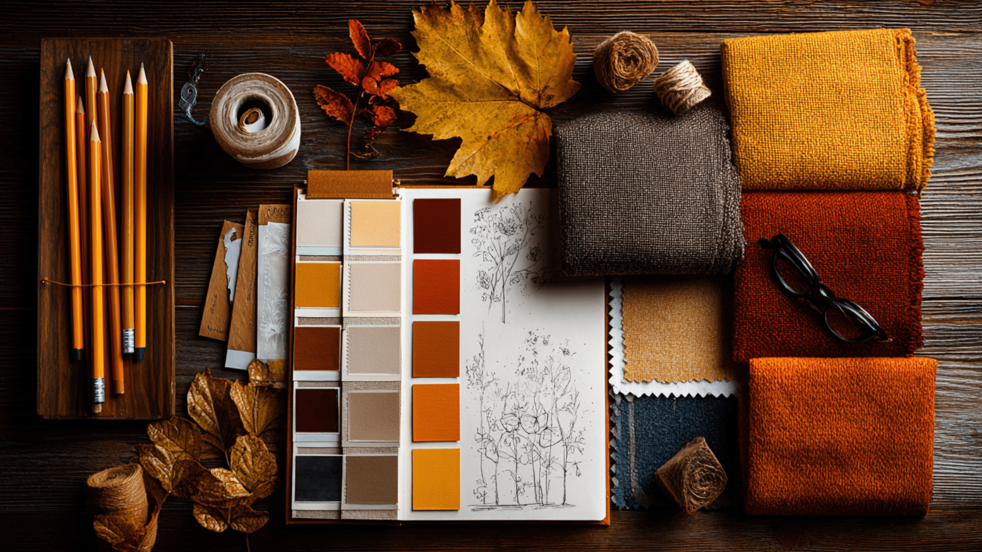
Fall is a season filled with inviting charm and rich, earthy tones. From golden yellows to deep burgundy and rustic browns, the colors of autumn create a warm and inviting atmosphere.
If you are working on a design project, decorating your home, or creating seasonal art, the right color palette can make all the difference.
Get inspired by beautiful fall color palette ideas, including soft neutrals, bold contrasts, and the timeless appeal of a true autumn color palette.
Each combination reflects the natural beauty of the autumn color palette at its best.
What are Fall Colors?
Fall colors come from the natural change in leaves as chlorophyll fades, revealing other pigments like carotenoids and anthocyanins.
Key pigments
| Pigment | Colors Produced |
|---|---|
| Carotenoids | Yellow, Orange, Gold |
| Anthocyanins | Red, Burgundy, Purple |
Common autumn colors
- Burnt orange
- Mustard yellow
- Brick red
- Olive green
- Chestnut brown
These shades reflect the warmth and richness of the autumn season.
Psychology of Fall Colors
Fall colors are more than just seasonal; they create an emotional response. These shades often bring out feelings of warmth, relaxation, reminding people of comfort, family gatherings, and seasonal changes.
Emotional meanings of fall tones
Fall tones stir a sense of change and familiarity, echoing moments of togetherness, seasonal rituals, and quiet reflection.
Shades like burnt orange and golden yellow create a cheerful, inviting atmosphere. These colors are perfect for making a space feel warm and welcoming.
Deeper tones such as burgundy and brown bring a sense of stability and grounding. Muted shades, like olive green or dusty rose, offer calmness and balance in any design.
Jewel tones vs. neutrals
Jewel tones such as emerald, plum, and ruby bring richness and sophistication, making them great for bold accents or luxury-inspired themes.
Neutrals, on the other hand, create a serene, grounded base perfect for layering textures and maintaining balance.
Choosing between jewel tones and neutrals depends on the mood you want to create: a bright or soft and peaceful one.
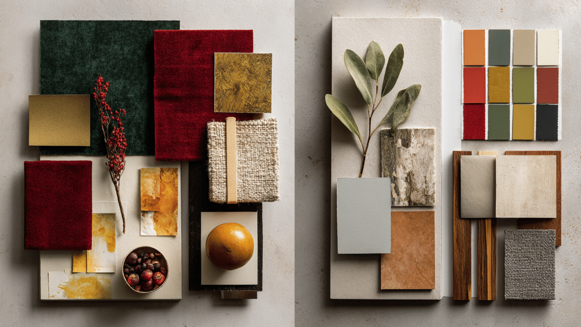
Popular Fall Color Palettes
Fall brings a variety of rich color combinations perfect for visual projects, seasonal decor, and creative expression.
Below are curated palettes with HEX codes and a glimpse into the mood each one creates.
1. Nature-Inspired Palette
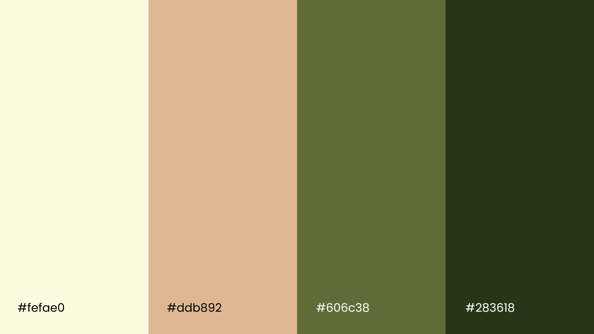
This palette reflects the peaceful beauty of autumn landscapes, think fallen leaves, forest trails, and golden sunlight.
Cornsilk adds warmth, Fawn provides a soft, neutral base, while Kombu Green brings depth and a grounded feel.
Ideal for nature-themed artwork, rustic home décor, or calming brand visuals.
2. Jewel-Toned Warmth
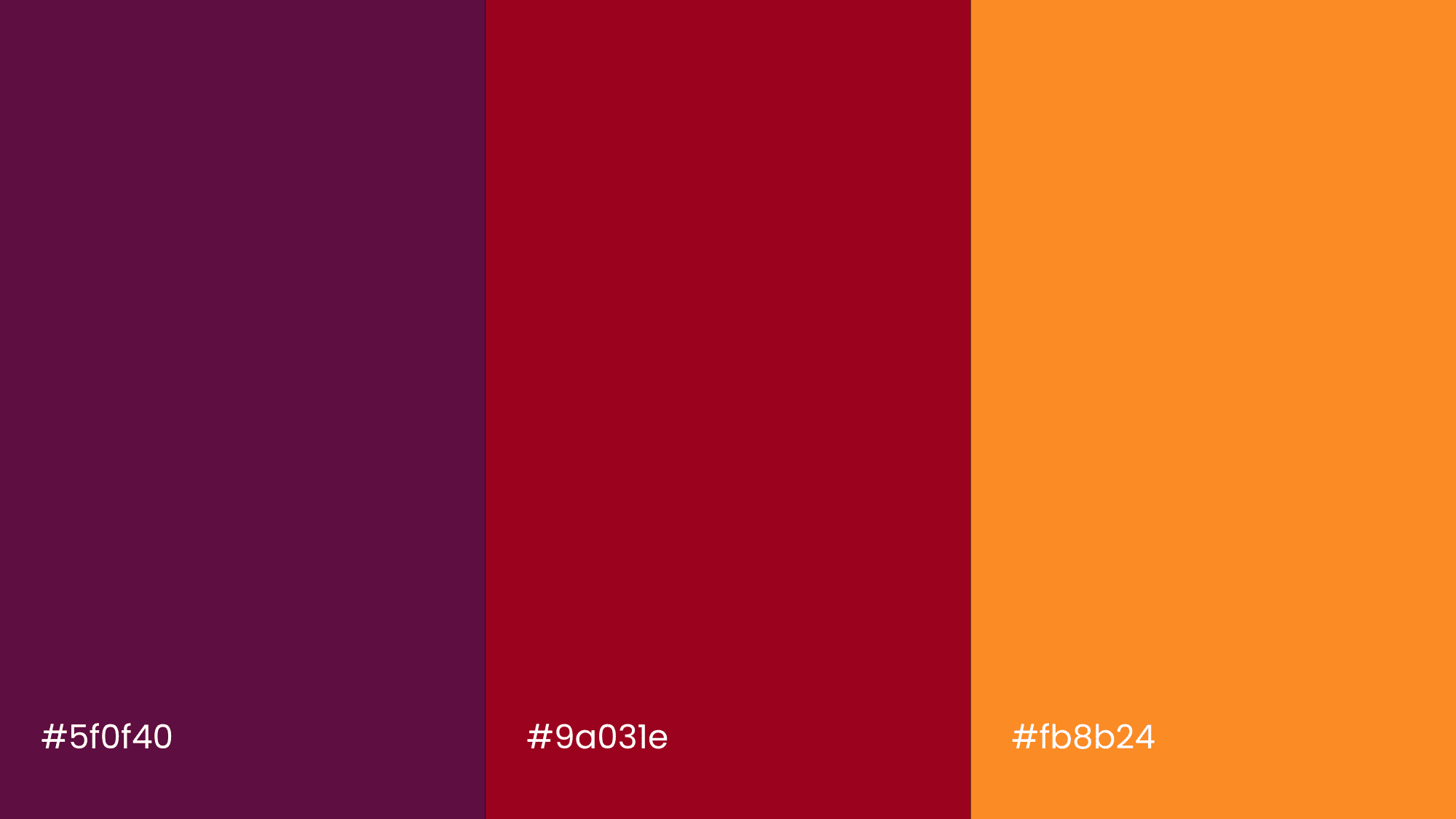
Perfect for creating a rich and welcoming atmosphere, this palette blends jewel tones with warm highlights.
Midnight Green offers classiness, Ruby Red adds bold emotion, and Dark Orange introduces a lively seasonal touch.
Great for elegant fall branding, dinner party invites, or luxurious design themes.
3. Earthy Neutrals
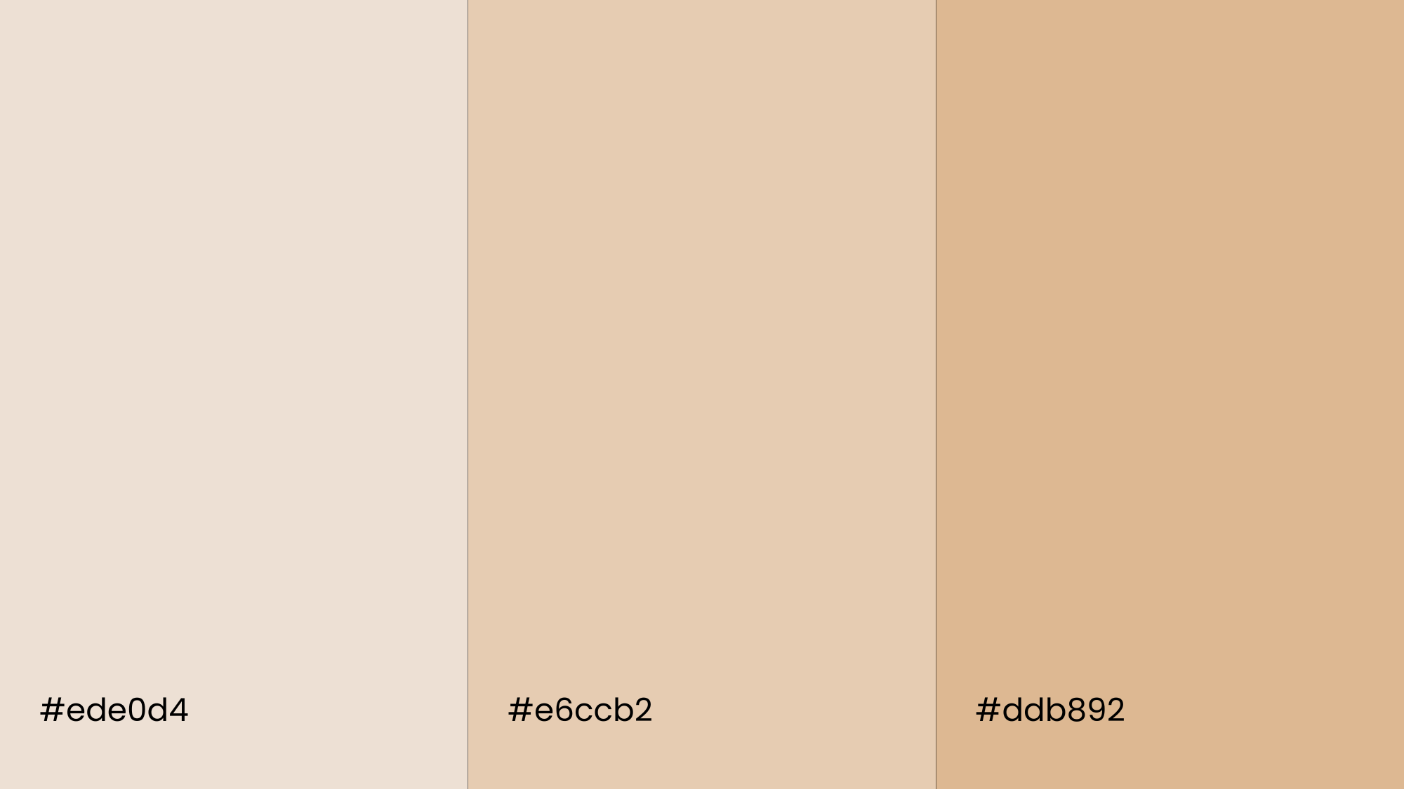
This palette is all about softness, comfort, and simplicity. With shades like Tan, Brown Sugar, and Almond Brown, it brings a quiet grace that suits minimal interiors, lifestyle visuals, or muted art pieces.
These tones pair well with organic materials such as clay ceramics, raw textiles, or matte finishes for a grounded, earthy look.
4. High-Contrast Scheme
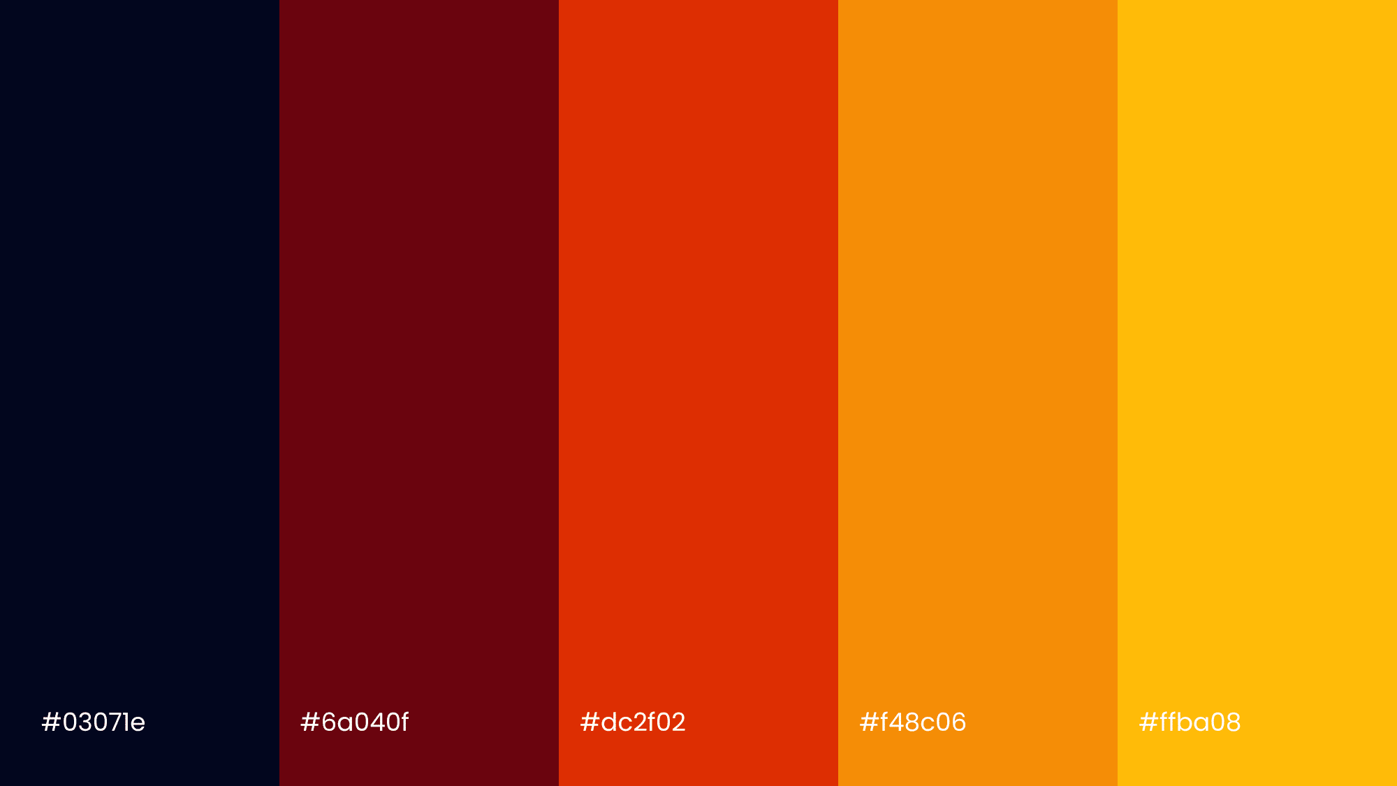
Bright and bold, this palette is made to stand out. The deep Black Pearl contrasts sharply with Vermilion and layers of golden yellows, creating energy and visual excitement.
It is a great choice for eye-catching posters, creative fall-themed graphics, or festive home accents that pop with seasonal color.
5. Soft & Muted Fall Pastels
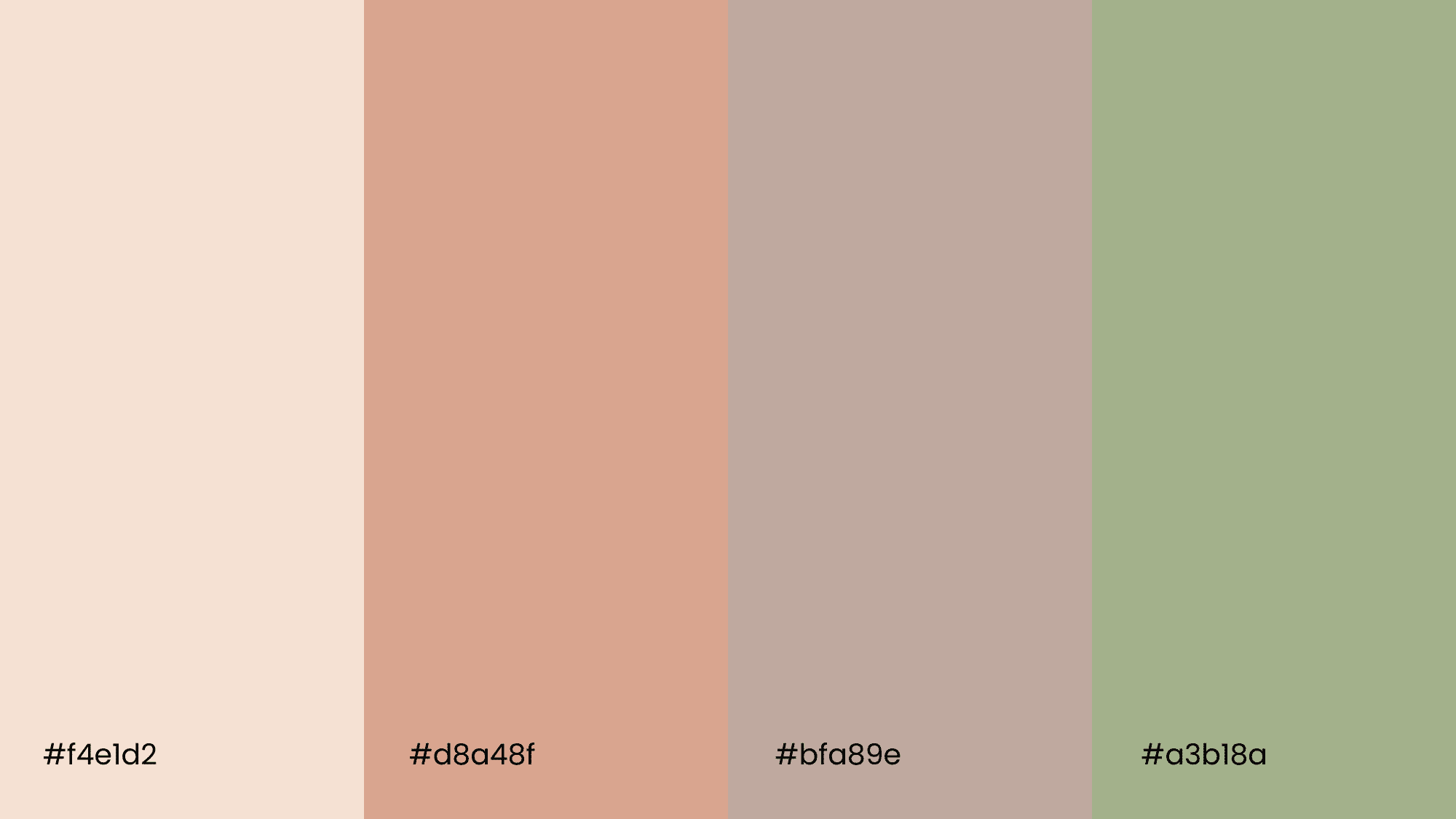
This palette offers a fresh, modern twist on traditional fall colors. It blends soft peach, dusty rose, warm taupe, and faded olive to create a light, airy feel with subtle autumn charm.
Ideal for minimal designs, fall wedding themes, or cozy spaces with a gentle, inviting atmosphere.
Palettes for Specific Uses & Audiences
Fall color palettes can be adapted for different purposes, depending on the mood or message you want to create. Here are a few ways they are commonly used:
| Use | Color Palette Example | Description |
|---|---|---|
| Branding & Marketing | Emerald, Ruby, Deep Plum | Adds richness and polish to fall campaigns; creates a bold, upscale look. |
| Wedding Décor | Emerald & Burgundy, Navy & Cream | Offers a romantic, seasonal feel; ideal for fall weddings with a classic touch. |
| Home Interiors & Paint | Pumpkin Cream, Autumn Spice | Warm, cozy tones that enhance walls and décor; perfect for seasonal refresh. |
How to Choose & Mix Fall Palettes
Choosing the right fall palette comes down to understanding a few basics and knowing how to style them effectively.
Color Theory Basics
Start with color relationships. Analogous colors (like red, orange, and yellow) sit next to each other on the color wheel and create a warm, blended look.
If you want something bolder, try mixing warm and cool tones for contrast, like deep orange with navy or olive green with gold.
Styling Tips
To uplift your palette, add depth through materials and accents. Warm metals like copper and brass pair beautifully with fall tones.
Combining elements like rattan, leather, or knits enhances the tactile depth of your fall palette and elevates visual interest.
Real-World Inspiration & Examples
Looking at how fall colors are used in real spaces can help spark new ideas for your own designs or decor.
Home Decor Ideas
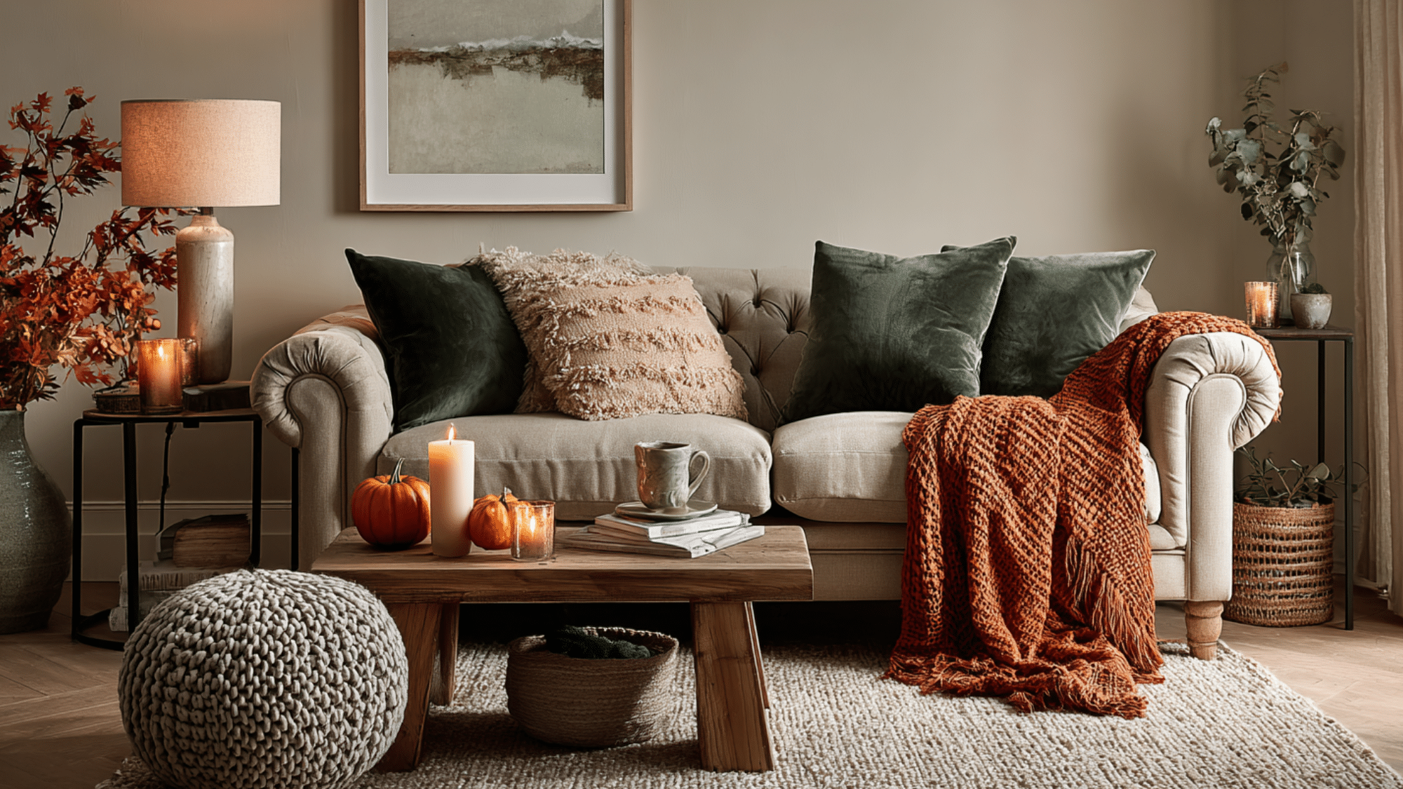
Fall palettes often appear in bedrooms and living rooms through cozy neutrals and rich jewel tones.
Think emerald green cushions, rust-colored throws, or warm beige walls paired with natural textures like natural fiber accents and warm finishes. These combos create a welcoming, seasonal feel.
Seasonal Collections
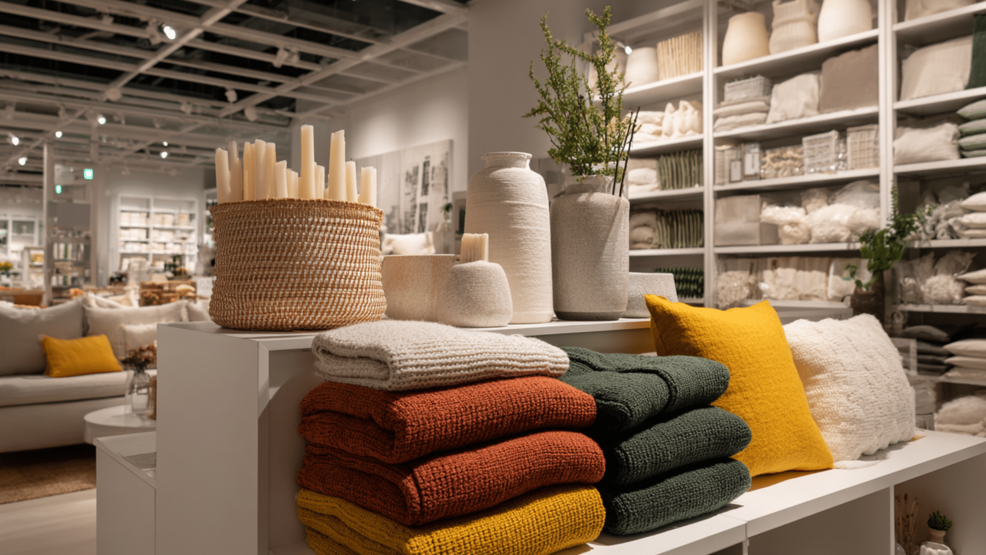
Brands like IKEA and Joanna Gaines’ Target line often feature fall-inspired collections using earthy tones like terracotta, deep green, and soft browns.
These curated looks are great references for building your own palette with balance and style.
DIY & Tools

Creating your own fall color palette is easy with the right tools and tips.
Palette Tools
Start by using free online tools like Coolors.coand Color Hunt. They help you mix and match fall tones, explore trending combos, and find HEX codes quickly.
DIY Tutorials
If you are working with paint, try mixing warm tones like burnt orange or deep olive to build custom swatches. You can also create digital palettes to test how colors look together in your design or space.
Pro Tip- Before using a full palette, try it on small items like pillows, artwork, or accent walls. It is a great way to test the vibe without fully committing.
Final Thoughts
Fall palettes bring warmth, depth, and visual harmony to any space or project. They help evoke a welcoming, autumn-inspired vibe that feels both natural and stylish.
To make the most of your palette, blend bold hues with gentle base shades and always test colors in natural light.
Experiment with test swatches or mockups before finalizing your palette to see how the tones interact in different lighting.
Most of all, enjoy the creative process. Fall is the perfect time to experiment with color and find what feels right for you.